This week I have another animal print illustration tutorial, zebra print. Similar to leopard print, which I wrote about here last tuesday, its organic, fluid and always different, therefore pretty difficult to mess up.

The key to a successful zebra print rendering is having a brush tip marker for the stripes. A brush tip is essential because you have to really "work" the marker tip. By pressing down hard for the thick areas then releasing up to the thin tip, you can achieve sharp points that create those fluid zebra stripes. Something else to keep in mind is the zebra stripe needs to be darker that the base color you choose. Here I chose black and white, but even in the examples below, with the more contrasting combinations, I rendered the stripes always darker than the background. It is possible to reverse them and render the stripes light with a charcoal pencil or gauche, but its not something I practice or recommend.
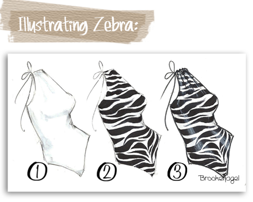
1- Color the base coat color and fabric shadows. For my example here since I went with a classic black and white print, I skipped putting in a base coat and only drew in shadows, which you can see in faint gray on the left side of the bathing suit, beneath the bust, and into the shoulder gathers.
2- The zebra stripes are next. As I said, a brush tip marker is vital for these to be really successful. You can start your stripes from the top of the garment in simple horizontal stripes then alternate from side to side. (See example below.) First a thick stripe coming out from the left side of the garment into a thin center line. Then from the right, pressing my marker down on the right side and releasing the marker tip up into the center just below the previous stripe from the left. And so on, covering the whole garment.

You can also start with or put somewhere in your print a "V" formation. This will mimic the center of a real zebra hide. (As I did towards the lower half on my bathing suit illustration.) If you'd like to opt for something more stylized or just do not want that center V shape, then you can stick to stripes, as I did with some of the illustrations below.
3- Highlights. With a white pencil or white charcoal add highlights. This will give the print depth and dimension. I added highlights along both front sides (or princess panel area's for those of you design students) as well as into the gathers at the shoulder.

Similar again to leopard, zebra can be rendered in any combination of colors to achieve different looks. Shown here (above) are two illustrations I drew with browns and natural tones for a more natural/safari look. While below are two where I went a little nuts with color. The first one on the left is a very 80's vibe with the saturated fuchsia and black combo and the one on the right is something a little sweeter, a pale pink background with coral stripes.

Zebra is truly one of my favorite prints to illustrate, paint, and have in little bursts around me, like on my umbrella, a clutch or scarf. In college I even had an entire accent wall of my bedroom that I painted in black and white floor-to-ceiling zebra stripes! Its classic and chic and in my book a fashion staple.
Let me know in the comments section how your zebra stripes turn out and what Tuesday Tip tutorials you'd like to see in the future.
(For this post I used pencil, white charcoal and Copic Sketch double-ended markers, offering both medium broad and super brush tips.)
(For this post I used pencil, white charcoal and Copic Sketch double-ended markers, offering both medium broad and super brush tips.)


