Orthodox Bride

Thursday, February 25, 2010
Meet my beautiful friend Sarah. Sarah commissioned me to do a custom illustration of her in her wedding gown. (I didn't know her at the time of her wedding otherwise I would have offered one as my wedding gift, as I do for all my friends who are about to head down the aisle!) Sarah is an Orthodox Jew and therefore her wedding gown was modest, with a high neckline and long sleeves. This was out of my "bridal drawing comfort zone".
Drawing a bride is hard because they wear intricately detailed white gowns that I have to draw on white paper. Usually all the skin shown with a strapless gown helps to give the illustration depth and a frame of sorts around the dress, so this one obviously didn't have that. Also, knowing Sarah, she is such a beautiful girl, both inside and out and one of the most kind hearted people I've ever met. I wanted to really capture her in my illustration. (cheesy I know, but its true!) But I'm really pleased with the outcome and so was Sarah.

Barely There

Wednesday, February 24, 2010

Tuesday Tip: Illustration Poses

Tuesday, February 23, 2010
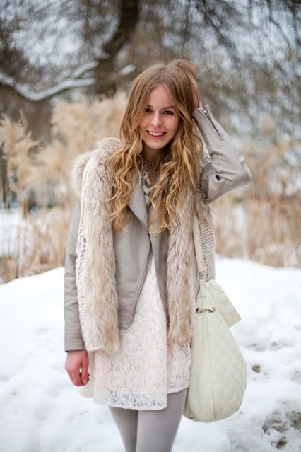
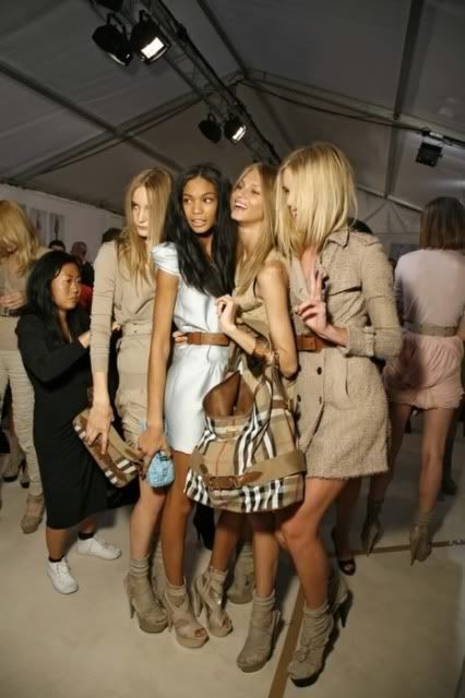
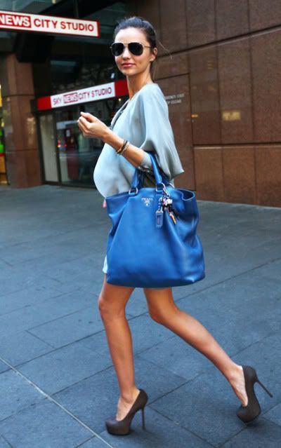
The first step in tackling any fashion illustration is to choose a pose. Looking at a picture is the best way to do this. It takes some time to find good poses, so you should hold onto them and start a "pose" folder for future reference. I've found that be best resources for tears are high fashion magazine editorials and catalogues. Bathing suit layouts are great because the figure is not hidden under clothing.
The most important element to look for when choosing a picture is that the top of the head to the tip of the toes be visible. It must be a full body shot otherwise your just guessing what the legs or feet look like and your drawing can come out distorted if your guess is not accurate. In the beginning its also best to choose poses that are straight forward, with the head and body facing front. Three quarter poses and profiles can get tricky.
When starting your drawing keep in mind the shoulder line and the bust line are parallel to one another, as are the waist line and hip line. The high hip is also the leg that the body weight rests on and cannot be changed. Yet the other leg, the "free leg", can be positioned many ways as I've illustrated above. The arms can also be arranged in any way but a bent arm with hands on the hips always give a nice effect and adds some nice negative space to your illustration.
To begin drawing a pose from a photo it's helpful to make a copy of it (or place tracing paper over it) and draw the shoulder, bust, waist and hip lines as well as the center line and panty line, as I have done with all these images. (This helps to know where seams and other clothing details should be placed.) Then draw a loose gesture drawing to get the main muscle masses down. You can create the final sketch outline from the gesture drawing and erase the unnecessary inner lines or just layer on another piece of tracing paper or thin marker paper and outline the body. Then start designing!

If you have any "pose" questions ask away in the comments section. This way everyone can see your question and my answer. I hope this was helpful!
All poses taken from Saks Fifth Avenue ads and www.Saks.com

Book Time {Part 3}

Monday, February 22, 2010
A few weeks ago while in my local bookshop I decided to stop by the crafting aisle and this book caught my eye; Blogging for Bliss. Being a fairly new Blogger I picked it up and started thumbing through it. I realized I was standing there reading entire chapters and I should just buy it and head home. While waiting in line I flipped the book over to discover a familiar face smiling back at me! The author of the book, Tara Frey, was one of my very first freelance illustration clients! Small world right!Besides the excitement of knowing the author, and reconnecting with her, Blogging for Bliss has been a fantastic resource. It's packed with great tips and how-to's, informational tools, and behind the scenes stories and inspiration from successful design bloggers, including my current teacher Ms. Holly Becker of Decor8!
It's a great book and since many of you, my readers, are bloggers yourselves, I thought I should share this fabulous find. I've added it to my Amazon Book Shop, which you can purchase by clicking here. (By the way I learned how to set up a Amazon "astore" from reading this book!)

Shades of Blue

Photobucket

Photobucket

Photobucket

New York Fall 2010

Photobucket
Source: style.com


Retail Therapy: Love Birds?

Thursday, February 18, 2010
Today I'm off to a wedding, my dad is getting remarried! I found these bride and groom rubber duckies at Michael's and couldn't resist. I have a "real" gift in the works but since I couldn't arrive empty handed I bought these cuties. What's so ironic is I literally wrote an article (here) on giving the perfect "Wow Wedding Gift" and this is what I'm handing them on their wedding day?!?!

Tuesday Tips: Hair

Tuesday, February 16, 2010
This is the first post in a new series I'm starting for the next 4 weeks called Tuesday Tips. Every tuesday I'm going to post a little tip for you. Whether your an aspiring fashion illustrator or just dabbling and looking to try it out, I'm hoping my tips will come in handy. First up; Hair.
The most important thing to know when illustrating hair is to draw the hair as it grows and flows, as you'd brush it, roots to ends. Hair should not be colored as a solid mass of flat color. Also pay attention to the color variations and the shadows. Flip through a magazine or pick up some personal photos and look at the hair, there are deep dark shadows, the darkest of which are around the neck, and bright highlights on the top and sides where light hits.
I've drawn these three girls to clearly show you my process. First I draw a pencil sketch. Secondly I apply the main colors in marker. Then I polish her up and apply all shadows and highlights with colored pencils. Now if only styling my hair in real life was as easy as one two three. :)
You can also check out my Doodle Darlings to see line drawings of different hair styles, which you can look at as a base, before coloring, like the pencil steps shown here.

Fashion Walk of Fame

Monday, February 15, 2010
This is one of those random things that you probably wouldn't know about if you don't regularly walk through New York's Garment Center; there is a Fashion Walk of Fame. It's like Manhattan's version of the Hollywood Stars Walk of Fame, just not as well known or as old. (They started it only ten years ago.)
I wanted to post about it because in addition to designers names and bios, each floor plaque features an iconic sketch. (And you know how I love designer sketches!) So just for you I stood in the middle of the very busy sidewalks of 7th Avenue with my camera pointed to the floor! I was totally embarrassed mind you, and made my friend Jackie stay on the phone with me while I did it.
The "Fashion Walk of Fame celebrates excellence in American design by honoring the New York designers who have had a significant and lasting impact on the way the world dresses."

Portfolio Mood Board

Friday, February 12, 2010
Since I've been on a little mood board/inspiration kick this week I thought I'd share a mood board from my product design portfolio with you. For nearly four years I was the Designer of a Brand Development Department. One of my job responsibilities was to create seasonal trend boards for brand managers, editors, retailers, and licensees.
Ballet Dreams is a board I made to inspire a teen bedding collection. In person the board measured about 2' x 3' and was three dimensional, but it's hard to tell in the photo. Maybe this board will motivate you to pull some looks together and find fabrics, colors, and images that inspire you.

All the fabrics used on the boards were purchased at Mood Fabrics. Unfortunately I made this a while ago and do not have much credit information for the images, I am sorry. Top left: Michael Kors bathing suit, Top right: Balenciaga, Bottom right: Lovely by Sarah Jessica Parker ad.

Courthouse Catherine

Thursday, February 11, 2010
Earlier this week I had the pleasure of serving jury duty. I had to wake up super early, head down to Centre Street in lower Manhattan, then spend a day being questioned by lawyers and a second day sitting around waiting to be released. (<-Yay, no more jury duty for 6 years!) Although serving jury duty is not thrilling, it was exciting to walk into this Supreme Court landmark and feel like I was walking into a movie or the set of Law and Order.
Every time I pasted through these giant pillars I thought about the shading on my Catherine illustration. Is that strange? Probably, but then again, the classic columns of the courthouse and design of her gown do have the same Grecian inspiration source.

Lovely List: Design Ideas

Wednesday, February 10, 2010
Design inspiration can come from anywhere and anything. A blank piece of white paper and a pencil can be very daunting, sometimes it really helps to have a specific theme or inspiration source. I've assembled a list for you of possible design ideas to work from. (I actually LOVE making lists. There's so much satisfaction in checking something off a list!) Some of these were assignments of mine from college (FIT) and others I just came up and think could be fun.
  • A collection inspired by costume history. Dig deep, how about a contemporary Egyptian inspired collection?
  • Design a wardrobe for your favorite character from a book, film, television show, etc.
  • Design a concert wardrobe for your favorite singer.
  • Pick 2 opposing looks or ideas and meld them together, for example: Urban Quaker, Athletic Granny, Socialite Nun, or Biker Ballerina.
  • Your favorite childhood outfit. I know you know the one! Why not use it as inspiration?
  • Pick a country or a favorite vacation spot and google image your way to an inspired collection. Why not research Bali, Morocco, Israel or Switzerland and see what inspiration you may find.
  • Chose a designer and a theme and design a collection as though you've just been hired as their head designer. One of my favorite projects from college is a collection I designed for "Bob Mackie inspired by Kabuki Couture".
  • Create a mood board. Either base it around a theme, with one of the ideas listed above, or create a collection of images or swatches with a similar color scheme, or of papers and textures, like the one I have photographed here or in my previous post.
Design away, and see where the inspiration takes you!

Mood Board

Saturday, February 6, 2010
I’m currently taking an online class given by Holly Becker author of Décor 8 and Leslie of Creative Mint. This week’s homework assignment was to create a personal mood board. I’m pretty happy with it, so I thought I’d share it here with you. The photo above is the whole board and below are some close ups I wanted to highlight.
As you’ve probably noticed if your one of my regular readers, I’m currently loving black, white and pink, so those are the colors I decided to work with when developing my board. I thought it was important to have layers of textures so I included: foil printed wallpaper, textured handmade papers, studded black leather, pink tulle, patent leather alligator paper, stingray textured paper, pompom trims, silver metal rimmed tags, and spiral sketchbooks. I really love the juxtaposition of textures like the biker studs and ballerina pink tulle mixed with fashion illustrations and super glam silhouettes!
I also love this black and white photo! In real life I’m a curly girl, the default photo I have on this blog is just the result of a great blow out, my hair doesn't really look like that on a daily basis! So I’ve always gravitated towards images and art with curls, especially when they’re this bold.
Being an artist, and that a big part of this blog is about my artwork I chose to include some of my illustrations. Most are from my etsy shop, but there’s also this sketch I did of my friends little sister that I’ve always really liked and her casual cool vibe just seemed to fit.
In addition to imagery that I liked I also chose key words that resonate with me, and what I want for this blog and for my life really; fashionable and chic, create and inspire, and fabulous doodles.

Secret Weapons {Part 2}

Wednesday, February 3, 2010
I received such great feedback last time, so I thought I should open my bag of tricks and share more of my favorite art supplies for tackling fashion illustration. First up; colored pencils. I know there's no big shocker here, but since people have asked I thought I should share with you the brand I prefer, Prismacolor.
In my previous secret weapons post I told you about the importance of cool gray 90%. Other colors I have on heavy rotation are white,blush pink, peach, dark brown, cream, and cinnamon. I try to be delicate with these pencils and store and carry them separate from your markers. A little "tip": if they get banged around a lot then the inner lead breaks and its practically impossible to get a good point on them. I keep my most frequently used colors in my new penguin pencil holder from Duck Drake Studio. After assembling my holiday gift guide I had to have it! It's ceramic with a white matte background and shiny glazed penguin and inside.
Prismacolors are on the soft side, which I like when drawing but the down side is that they need to be constantly sharpened. This brings me to the next vital weapon in my arsinal; the electronic pencil sharpener. After going through a few of them over the years I've settled on this Panasonic battery opperated one. It gives a nice long point and has a good amount of power, especially for being battery operated.
Micron pens are essential for intricate details. They come in a few colors and many sizes but the one I have to replenish the most is the 005 in black. This is a superfine tip, only 0.2mm line width of waterproof pigment ink. I often use this pen to render lace, as you can see here on Audrey II and for line drawings, like my lined ladies.
And last but not least, eyeshadow. Yes, eyeshadow. I have a few different uses for it, but mainly I use it for poufy/curly hair (as on Blair here), fluffy feathers (like the ones here on Marie), and to render fur, which I softy add faint pencil lines to. Unfortunatly I don't have any illustrations handy with fur, but I promise I use it and it works brilliantly. The best shadows to use are the cheapest ones your drugstore has, like Wet'n'wild or N.Y.C. They come in a million shades, can be as cheap as a dollar, and come with the mini spounge tipped applicator wand which is the ideal tool I use to color directly to the paper. I recently did a big cleaning of my apt and threw mine out figuring I'll just buy new the next time I need it. That's why the shadows pictured here are a little fancier that the drugstore ones, but I promise the junkier ones work better. Hope this helps everyone, happy drawing.

Book Time {Part 2}

Monday, February 1, 2010
"Fashion Illustration By Fashion Designers" by Laird Borrelli has been gracing my coffee table since receiving it as a birthday present back in August. I thought it was time to share some of its fun designer sketches with you. This book is a wonderful collection of full color fashion illustrations by sixty of todays top designers. (And as if that wasn't reason enough to love it, the white on white polka dot cover is a lovely compliment to my apartment decor.)
(Bruno Frisoni for Roger Viver "London Event"
Marker pen and colored pencil on paper, April 2006)
"Fashion illustration is a medium in which creative expression can be given free rein and designers can explore ideas before the realities of budgets, fabrics or physics intervene. Designers' sketches reveal inspirations, offering insight into a key, usually invisible, part of the creative process." (Borrelli, cover flap)
(Alexander Terekhov, Ink and watercolor on paper, 2003)
(Gianfranco Ferre, Ink on paper, Haute Couture 1987)